
PHASE ONE
COVER PHOTOGRAPHY
You’re lucky enough to be in a position where you can both photograph and design magazine covers, but in the real world it typically doesn’t happen this way. Often the magazine art director (AD) isn’t even involved in the shoot – they simply receive the end result and need to “make it work.”
|
Camera vs. Magazine Proportions
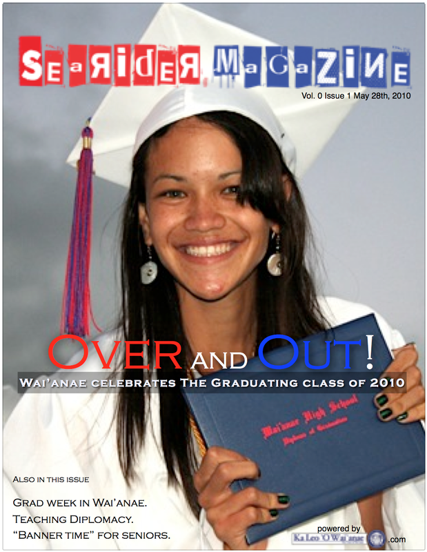
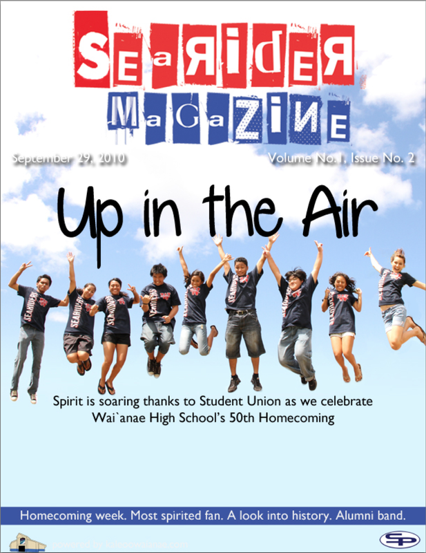
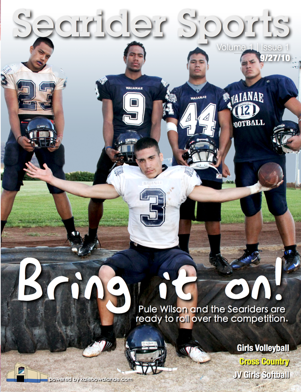
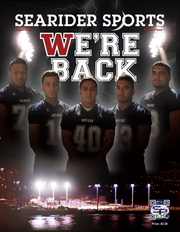
Regardless if you shoot horizontal or vertical frames, you have to zoom out. All your relevant content needs to be within the inner area. It feels really unnatural and uncreative from the photography standpoint but it will save you in the design. |
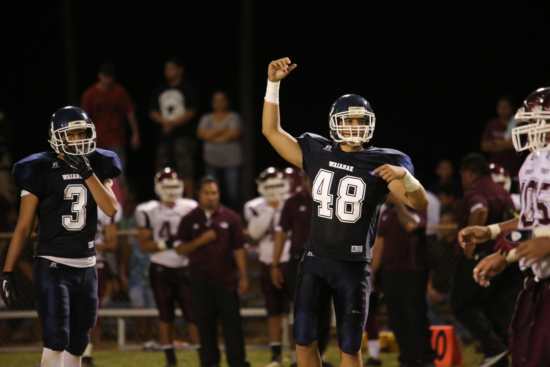
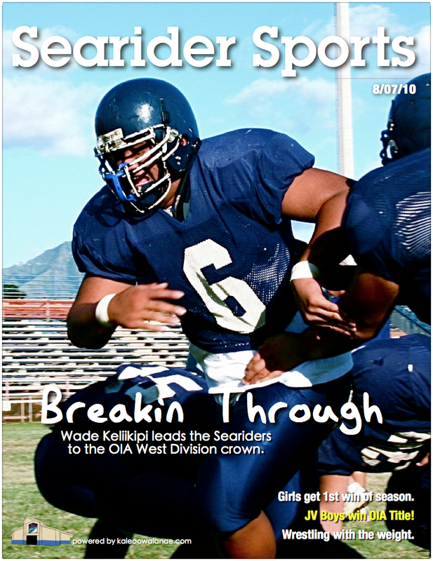
Original Photo
|
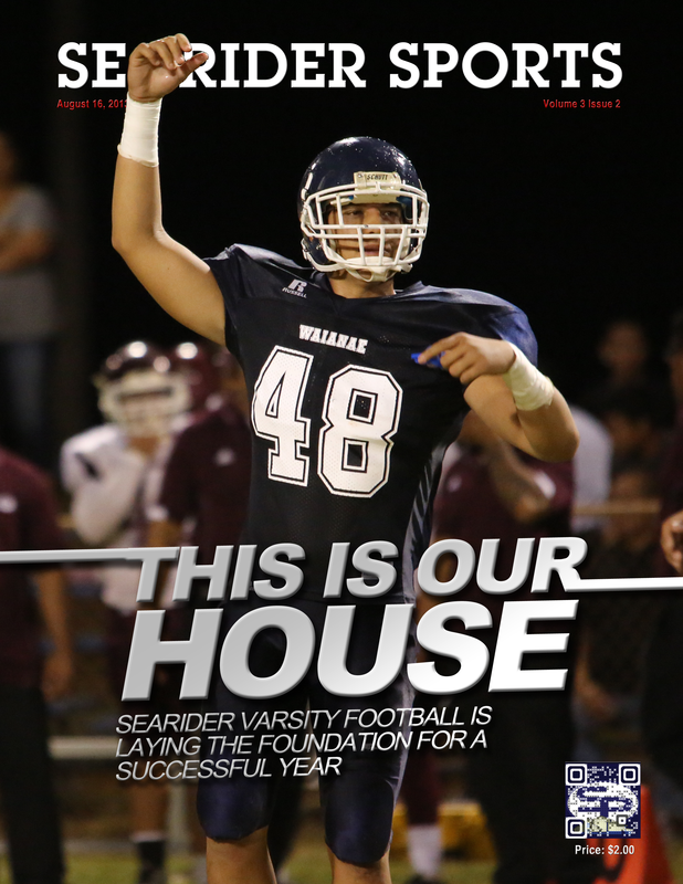
Cover Photo
|
|
Including White Space
You need to include white space around your subject for cover lines. A creative workaround is to include white space in your compositions – areas for your eyes to rest (for photos), OR areas for type-crazy AD’s to fill up with copy (text). Variety of Options
Force yourself to change the shoot before you run out of time – to try another idea. If you work smart and are prepared, use any extra time to do something off-the-wall or unexpected. Getting the main concepts out of the way will not only boost your confidence, but it gives you the opportunity to really flex your creative muscle, without the stress that forces you into cookie-cutter, tried-and-true (see: boring) solutions. |
White Space
|
|
|
|
|


Supplemental Activity
|
Description
Look at the cover photography above and discuss the moods, themes and differences each present. |
Objective
Students will learn the art of visual aesthetics. |
Rubric
Below - Students do not demonstrate knowledge of techniques in discussion. Met - Students are providing articulate and meaningful critiques of the work. |
